

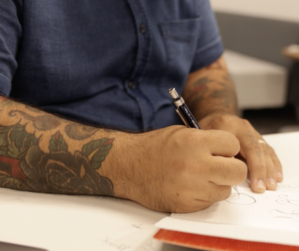
Im so excited to announce that I designed the 2025 Atlanta Pride logo. I was selected from a competition where several artist/designers submitted a logo variation.
The theme of this year’s Atlanta Pride Festival, Rooted In Resistance, is a powerful reminder of where Pride began—with protest, with community, and with a refusal to stay silent. It’s a call back to our grassroot beginnings, to the brave voices at Stonewall, and to the deep roots of queer resilience that have always challenged systems of oppression.
This mark is modern interpretation of stained glass, symbolizing the vibrant and colorful spirit of the queer community; bright like stained glass windows that shine and radiate colorful light wherever we go. Our community is rooted in resilience and strength, actively resisting adversity and embracing courage as we come out and live authentically. This logo embodies the power, diversity, and luminous energy that define us in our ongoing fight for acceptance, equality, and liberation.
Watch the interview.

The roots coming from the bottom of the fist represents the strength and growth of the community through a strong rooted system. The brown fist represents the resistance people of color have shown, pairing with the green fingers to form a tree. Backlit by a rainbow- the main symbol of the LGBTQIA+ community; filled in with the colors of the PRIDE flag.


